
Editoriais
|
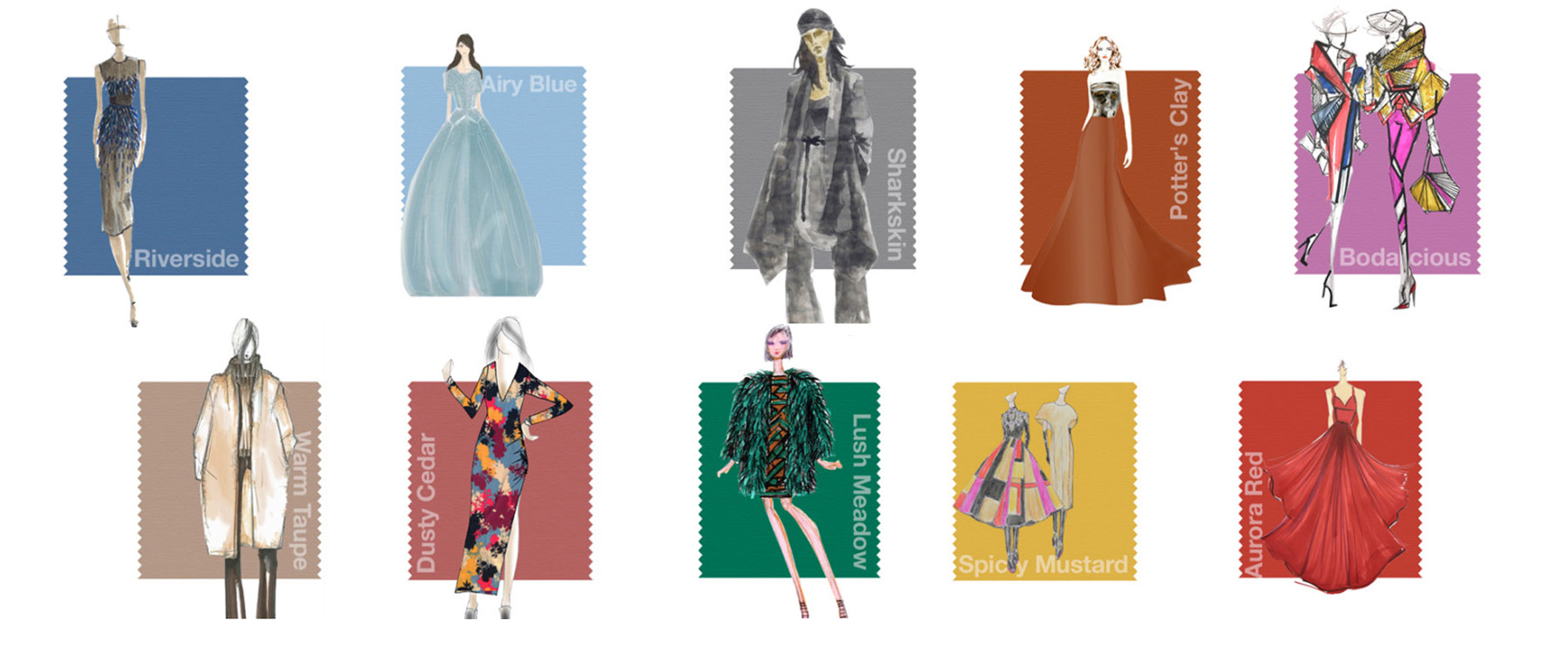
PANTONE FASHION COLOR REPORT FALL 2016
Every year Pantone launches the color trends chart in the fashion market, the Fashion Color Report Fall 2016. A color chart that will invade your wardrobe and inspire your looks this season.
Strength, confidence and complexity are the key words of the Fall / Winter 2016 collection. Marked again with the presence of blue, which was a key element in the Spring/Summer 2016 collection, it joins a set of vibrant and unexpected colors, composing a card full of exuberance and versatility.
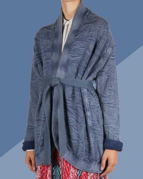
RIVERSIDE Mark the importance of blue in the chart. It features sophistication, strength and stability.
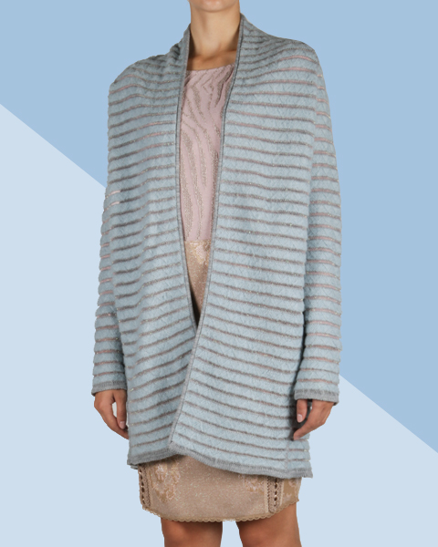
AIRY BLUE Light color that symbolizes freedom.
SHARKSKIN Conveys the feeling of stability, being easily combined with any other color of this card.
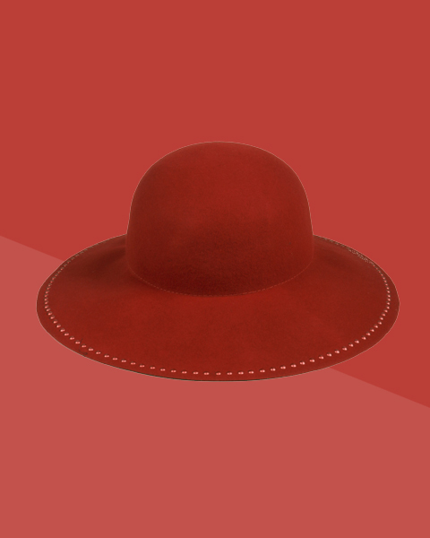
AURORA RED A sensual, warm and daring color, being an invitation to the heat, guaranteeing confidence and security.
WARM TAUPE Its timeless character can be combined with each of the 10 tones chosen for autumn winter 2016. It is a neutral and pleasant color.
DUSTY CEDAR Is a more complex color due to its sobriety, being a variation of the Rose Quartz of the last season. Conveys the feeling of warmth.
LUSH MEADOW Elegant, energetic and sophisticated, this shade reveals brilliance and depth.
SPICY MUSTARD Is the color that adds a different vibe to the new card. An unusual and unexpected yellow, more daring than in previous seasons. It stands out for its exotic feature, having been inspired by the abstract and geometric content used by many designers.
POTTER'S CLAY Inspired by the colors of the dry leaves that fall from the trees in autumn, this earthy color conveys the sense of depth and sophistication.
BODACIOUS It portrays the gender flow that makes up Pantone's proposal for this year 2016. A bright and versatile color, which can be combined with stronger colors such as pink and red.
|

[PRODUTOS RELACIONADOS]


;)